CAMP NORDEN
CREDITS
MY ROLE: Associate creative director, lead designer & photographer
—
RYAN DURRY: Creative director
MAX OMSIN: Logo animator & junior designer
MEGAN MORREY: Content writer
CESAR PEREZ VELIZ: Developer
—
Created at Children’s Cancer Research Fund
Naming / Branding / Collateral / Web
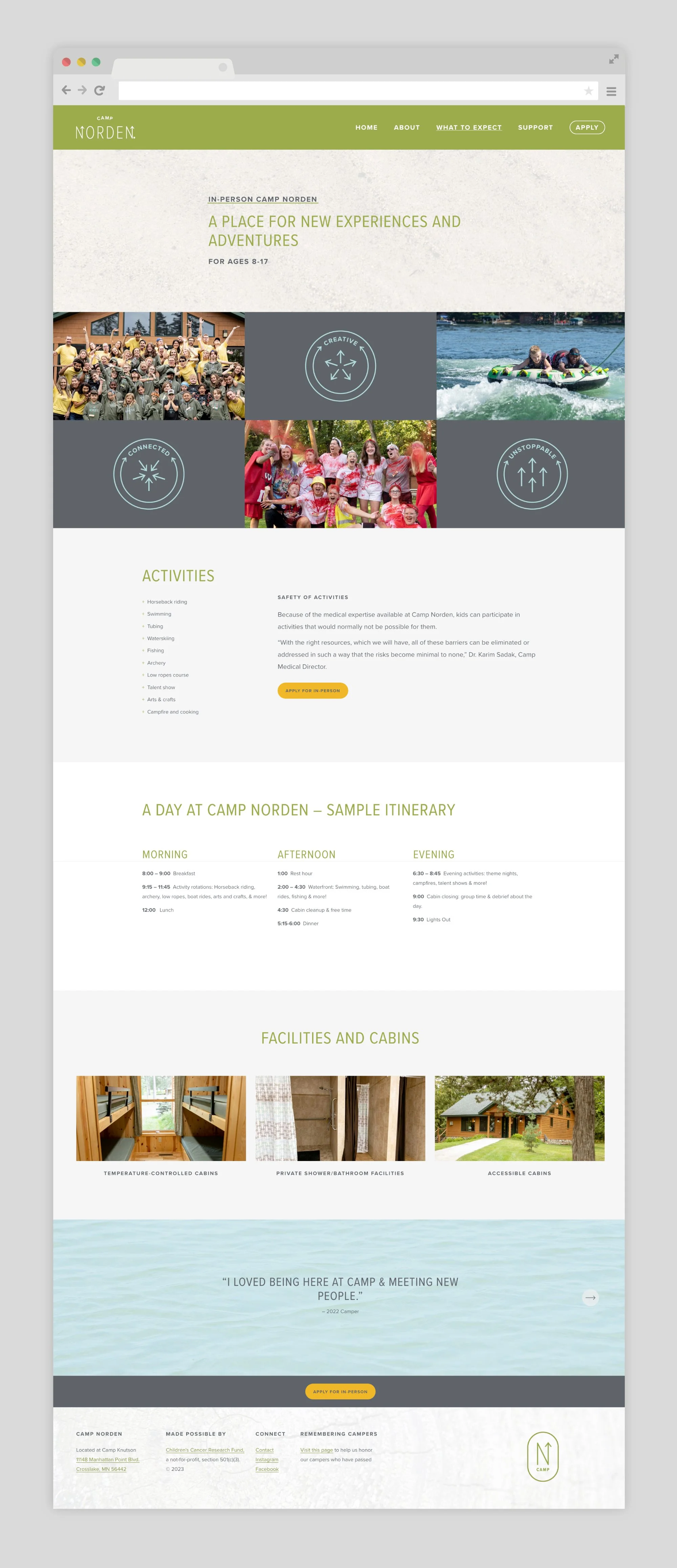
Children’s Cancer Research Fund expanded their family programs to include an in-person and virtual camp experience for kids who have or are currently experiencing cancer. It was important that this brand felt approachable and meaningful for kids aged 8-17.

The brand is rooted in the hope that each camper finds community and a way forward, even amidst the difficulties and after effects of cancer. Norden is a German and Scandinavian word meaning north. Heading north represents journey, adventure, and connection. North is a set point to turn to when you are feeling lost. Finding your own true north is coming home to yourself.


By sticking to mono line typography and shapes, the meaning of the brand is established in a way that is approachable for all campers. It is easy enough for an 8 year old to recreate with sidewalk chalk but not too childish for a 15 year old virtual camper.